Monday, August 15, 2011
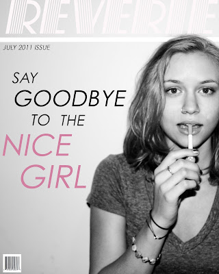
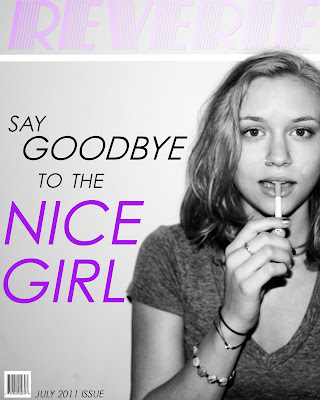
Magazine Cover
This was my favorite project of the semester. As a photo major it is a dream to have one of my photos on the cover of a magazine, so it was really cool to get to design a magazine cover using one of my own images. For the first version of my magazine cover I wanted to contrast the black and white image with a soft color, so I chose pink as the focal color. The comments I got from my classmates made me rethink how successful the color was, especially with how light the magazine name was. When I went back in to edit and fix the cover, I went with a bolder and brighter purple. I feel like the new color really pops next to the portrait. I also played around with the text to make it flow better and more present.
Dreamscape
For my dreamscape I chose to take an experience I had and translate it into something a little more fantastical. This past weekend I went camping with my friends and I brought my 35mm camera. I took this picture of my friends looking up at the stars. In reality they were only looking at stars, but what if they were looking at something crazier? I started out by selecting my friends Rory and Tim from the original picture. I basically created the entire camping scene (the people, tent, and grass) from selecting specific parts of different images. At first the only "surreal" part of this image was the sky, an image from a NASA telescope. I thought that I could push this further by adding the UFO, and even further then by adding the light beam. To me this image stands for the possibility that we are not the only ones that exist, and even maybe how if we could have looked a little further into the sky that night we might have actually have been able to see something like this.
I had a lot of fun doing this project, and learning more about photoshop altogether. Learning more about selecting is really going to help me with my work in photography and other projects.
Website Interface
I struggled with ideas for this project. It seemed like whatever I came up with looked tacky. After seeing my classmates' work, I realized that I definitely could have done much better. With this design I wanted to keep it simple, because I know that when I look at a website I want it to be as clear and understandable as possible. In retrospect, I should not have used all capitals everywhere, and possibly introducing more colors would have made this website interface a little better.
Logo Design
I wanted to keep the logo very simple, which is why I chose a basic font and color palette. In order to tie in the "green" nature of the product, I chose neutral earth tones for the color palette. I took the name of the product quite literally when thinking of an idea for the logo, placing a barefoot print into a dogbone or biscuit. I think the design is cute, simple, and effective.
Type Project
I like to use my own photography in a lot of my work, may it be digitally on illustrator or physically in paintings. I really enjoyed the idea of the type projects because it allowed me to use my own images as a starting point to create something completely different and abstract looking. I found the shading type portrait to be the most challenging, and the shape type portrait to be the most fun.
Architecture Project
For my architecture project I chose Taliesin West, the winter home and school of architect Frank Lloyd Wright, located in Scottsdale, Arizona. Wright started going to Arizona each winter starting in 1933, and in 1937 he purchased the plot that would become Taliesin West. Taliesin West gets its name from Taliesin, which is Frank Lloyd Wright’s summer home. Today Taliesin West is the main campus of the Frank Lloyd Wright School of Architecture, and is also the location of the Frank Lloyd Wright Foundation.
Wright took inspiration from his surroundings when designing Taliesin West. He said, "Arizona's long, low sweeping lines, uplifting planes... Surface patterned after such abstraction in line and color as find "realism" in the patterns of the rattlesnake, the Gila monster, the chameleon, and the saguaro... are inspiration enough." The building is made of local rocks and local wood, and natural light plays a big part in the design.
When I was recreating Taliesin West, I thought it was really interesting how I was taking the original architecture or form and making it my own. I really liked how similar the building structure in my recreation was to the original, but how by using different colors and values and staying away from textures, it turned into something completely different.
I really enjoyed learning how to use the pen tool, and also learning how to color on illustrator. I think these are two tools that are will help me out a lot in future projects.
Subscribe to:
Posts (Atom)